
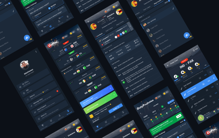
The Google I/O 2019 Conference marked the launch of the dark theme. And ever since, this design trend for mobile applications has witnessed widespread popularity. Tech giants like Apple and Android have gone big on this trend, dedicating their attention and resources to it since the past year.
There are plenty of reasons why several companies are getting on board with dark mode app themes, including improved readability, and reduced eye strain. Today, it is crucial for every UI/UX design company to keep a dark theme ready for their mobile app development clients.
Unfortunately, not all companies are aware of the best practices when it comes to designing a dark mode for mobile apps. To help you out, we have created this post that delineates the dark theme designing standards of a high-quality application. So without any further ado, let’s get started.
What is Dark Mode?
Dark mode can be defined as a low-light user interface that uses a dark color, typically black or shades of grey as the main background color. This is in stark contrast to the default white background that developers have been using since forever.
The switch to dark mode has been widely lauded as developers discovered that dark themes reduce the strain on eyes, especially in nighttime situations. This reduced strain improves user experience and promotes overall wellbeing.
Besides, dark mode saves battery life. Several digital gadgets with OLED screens can turn off black pixels when they are not in use. The dark mode uses more black pixels that force the gadget to use less energy.
Best Practices for Dark Mode Design
Certain processes must work out properly to create the perfect dark mode UI. Here is our checklist on the best practices for the dark mode that must be kept in mind to create a winning product.
- Abstain from using saturated colors
Saturated colors go very well with light surfaces, making the entire screen appealing. But when it comes to dark surfaces, you must refrain from the use of saturated colors as they vibrate visually and make it difficult to read the screen.
Go for desaturated colors in the 200 to 50 range as they feature improved visibility on dark surfaces. Lighter shades will help to maintain relevant contrast while making your UI expressive and easy-to-read.
Also, consider adjusting your brand’s color palette. Your company’s red might appear differently on a black background than it does on white. Colors in dark themes often need to be tweaked to prompt the same response from users.
- Have a proper contrast
Going as per Google’s Material Design guidelines for the dark mode theme, developers must maintain proper coordination between the text and the dark background. This contrast needs to be at least 15:8:1 for the text to appear clearly to the user.
Also, the text must have proper opacity levels. For instance, the important or high-focus text must have an opacity of about 87%.
- Use the correct “On” colors
“On” colors are those found on the top key elements and surfaces. They are typically used for text. For the dark mode UI, the default “on” color is pure white. However, this color vibrates visually against dark backgrounds, making it difficult to focus. Consequently, Google Material Design suggests using a darker white or light grey shade.
- Refrain from using pure black color
The dark theme of your app should not comprise pure white text against a black background. This will make it very difficult to explore and navigate the screen.
Instead, try using dark grey as the background color. This is a safer bet as it decreases the strain on the eyes and makes it easier for the users to gaze at shadows on a slightly greyish surface as compared to pure black.
- Contemplate your UI’s emotional aspect
Your standard mode has a possible range of valuable visual cues. Now when you are switching to a dark mode, you would want to convey a similar range of emotions. But you don’t simply reverse the hues to get your dark theme. This is because you may end up turning colors that had a psychological intention into pointless muted tones.
You need to be deliberate about your color selection and ponder your UI’s emotional aspect. Make sure that both themes induce various emotions that resonate with the users.
- Include dark themes into animations and illustrations
In case your app includes heavy graphical elements, such as animations and artworks, you need to modify them to suit the dark mode. If the artwork comprises a background and a subject, you must desaturate the background colors so that the users can easily focus on the subject.
- Carefully test the UI in both dark and light themes
To make sure your app performs well, you must test both light and dark versions of your design. Look into the appearance of the UI and tweak the design as required to accommodate both themes. It is also a good idea to test your design after twilight with bright lighting.
- Allow the users to turn the dark mode on or off
Permitting the mobile system to decide when to turn on or off the dark mode is not a good way to go. The choice can lead to poor user experience as it lets the system take control of users and make the decisions for them.
So, make sure to not auto-enable the dark theme. Allow the users to select the mode manually, depending on their requirements.
- Use the elevation tool
Every app is made up of several components, and each component has a certain level of elevation. In the light theme, it is wise to give a shadow to each component, depending on its amount of elevation. However, the same principle doesn’t apply in the dark theme as a black shadow on a dark-colored background will not be perceptible.
Consequently, Google advised making the components in the dark theme lighter as the elevation level increased. But it should be noted that components in the dark theme will continue to have the same shadow settings as in the light theme until changed.
Wrapping Up
Although dark themes have several advantages, implementing them properly is quite challenging. If you follow the quick way of inverting colors and reusing them, you will maximize eye strain and provide a poor user experience. So, it is best to get in touch with a professional Mobile App Development company who can help you execute an effective dark mode theme. This will help you provide a useful and healthy user experience.
Author Bio:
James Grills is a marketing advisor – currently associated with Cumulations Technologies, a Flutter App Development company. He is a technical writer with a passion for writing on emerging technologies in the areas of mobile application development and IoT technology.


