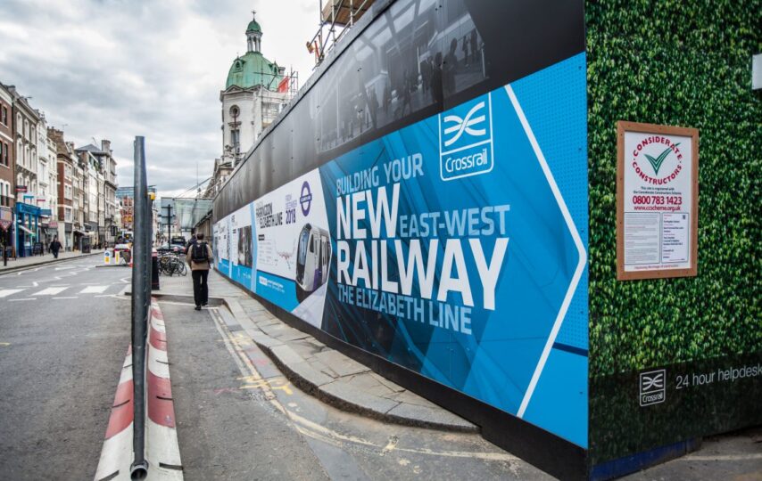
A simple message and a memorable design are the key factors that determine the positive outcomes of advertising hoarding. When it comes to maximizing all that a space has to offer, the following tips can help you ensure that your marketing efforts pay off tenfold!
1. Create A Budget
Having an established budget will make it easier for your team members to create and design a hoarding advertisement that speaks to your intended audience. A solid idea of budget can also help determine the type of cladding used for the hoarding. For example, dibond is great for universally all developments while vinyl is ideal for a more professional or polished look.
2. Know The Site
Survey the site before designing the hoarding boards to ensure that it will seamlessly blend into its surroundings. It’s also crucial to ensure that the hoarding displays well without being obscured by any pre-existing structures. For example, a horizontal design on a hilltop doesn’t work, meanwhile your web address may get obscured by a rogue light pole. When designing a hoarding, it’s also crucial to consider the safety of the location as well as accounting for inclement weather.
3. Know Your Audience
A solid design is one that directly speaks to your target audience. In short, know your intended market because that translates to graphics and text that appeal to your chosen crowd.
4. Avoid Clutter
Your key messages should stand out on your hoarding from a distance, so it’s advisable to avoid cluttering the design with too much text or imagery. Most people only pay attention to hoardings for a few seconds, which is why a great graphic with a simple text will really stand out.
5. Keep Your Brand Consistent
Your hoarding design should seamlessly blend into your other marketing channels. From your brand’s logo colors to other existing marketing campaigns, consistency is key to developing brand awareness.
6. Maintain The Hoarding
It’s crucial that your hoarding is a professional representation of your brand. That means you will need to occasionally refresh and recreate the design. Likewise, this also includes necessary evils such as repair and maintenance to ensure the structure looks sleek and elegant.
7. Consider All Angles
People will be walking or driving by your hoarding during all hours of the day, therefore, it’s crucial that your design works in all ways from every angle. Lightboxes and header or kicker LED lighting can help you illuminate your efforts to ensure that your sign stands out.
8. Make Your Logo Stand Out
Your logo should draw the attention of all drivers and pedestrians while helping people make the connection with your development. A great way to specially call attention to your company’s logo is to install illuminated letters or a lightbox that can help highlight your logo especially.
9. Complement Surroundings
You can not only sell the surrounding real estate but also call attention to the desired traits of a town or a city. Create a hoarding that complements the surrounding natural elements or buildings as it can help people recognize the positive aspects of a location. The key is to highlight what really makes the area unique or one-of-a-kind.
10. Elongate Your Design
There’s a standard size for all hoarding structures, but it’s important to consider the length and height of your design when being on display. Add height at corners or points to ensure that your hoarding is not obscured by construction or natural surroundings.


